Request a brochure
To request your brochure, simply fill in the form below and we will email it directly to you...

Ecovision
Branding
A view to an even greener future for Harrison Products.

A new eco-friendly brand for Harrison Products
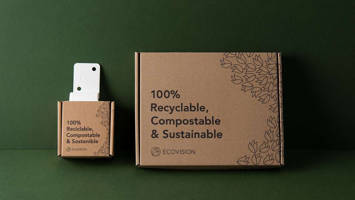
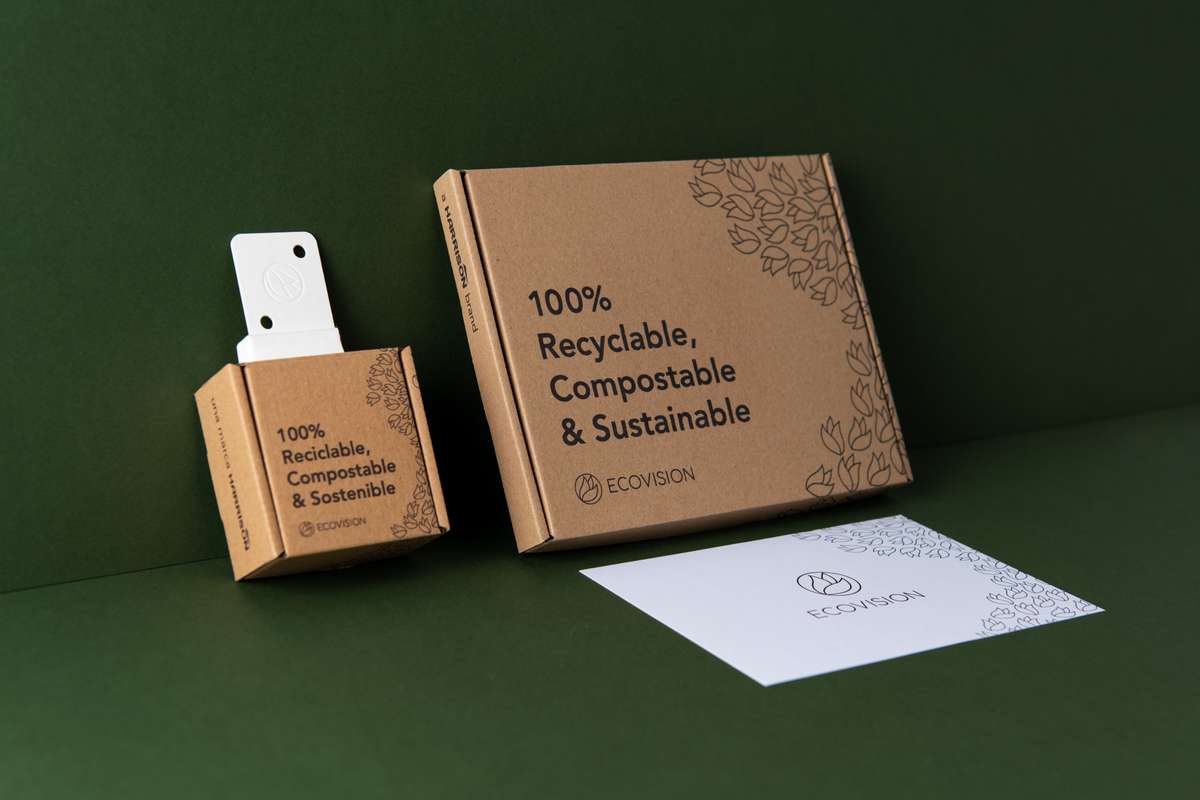
Harrison Products were in the process of launching a new eco brand for their latest range of POS and installation products called ‘Ecovision’. All the products that this brand offers are recyclable, sustainable, compostable or made of recycled materials.
The first product being introduced is a Cardboard Corr-a-Clip used for mounting display items. The Corr-a-Clip is made from a natural fibre completely unique to Harrison which decomposes within 90 days and can also go into the same recycling stream as the cardboard it is attached to.
We work with Harrison Products on other aspects of their business and were asked to create a new identity for the Ecovision brand.

A Fresh Start
They wanted the brand to sit underneath the Harrison name but, like other sub brands they own, it did not need to adhere to the existing brand colours. As the brand’s priorities were eco, and sustainable we chose fresh, clean colours.
We started by designing a series of mood boards to capture different styles. These were:
“Fresh Dynamic” which used natural shapes and lines that could be seen in nature such as leaves and the ocean.
“Warm layered” which used warm calming colours that overlapped such as feathers.
“Modern Minimal” which used cleaner colder colours and designs to represent the compostable nature of the product.
In the end the client went with a mixture of modern minimal and fresh dynamic. Harrison Products liked the clean minimal design but wanted a clear nod towards nature. From here we went back and forth on a few rounds of designs and came to a finished logo.

A New Leaf
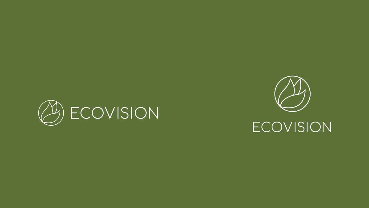
The logo itself is three, flowing leaves inside a circle, all in a line weight style. The leaves represent “Eco”, and the circle is the “vision”.
We originally had filled leaves in an eye shaped container. However, turning the leaves to strokes and changing the eye to a circle solidified and strengthened the design. The typeface 'comfortaa regular' is a clean sans serif font that instils a feeling of polish and a sense of being unpretentious in its simplicity.
The emblem can be used a standalone logo on a product but is also complimentary when placed alongside the name for the full logo.
