Request a brochure
To request your brochure, simply fill in the form below and we will email it directly to you...

Congresso
Branding
The complete branding project for Congresso

Naming Congresso
We had to come up with a logo and brand for Congresso’s new meeting and organisation app. At first, we explored alternative name avenues, but eventually we all agreed that ‘Congresso’ was the ideal company name. The requirements for the name were for it to be a spin on the word ‘congregate’, or another word related to meetings, and for the tone of the name to highlight the brand as premium, friendly, and easy to use.

The Congresso Logo
Multiple logo and concept ideas were considered during the initial design stages. The final logo was decided to include 6 circles and 6 colours. The main intention for these circles were for them to create a ‘C’ shape around the head of the ‘Congresso’ title. This formation is not only meant to look like a ‘C’ but also to represent people meeting around a table. The secondary, but important, use for the 6 circles is for each one to represent each individual step of their in- app process. The simplicity of this graphic device lends itself to having multiple other, extremely flexible, uses throughout all Congresso’s assets and branding. They are the building blocks that make up Congresso’s logo and underpin all design language decisions.
The distinctive coloured circles also led to the design of an easily recognisable Congresso favicon. The favicon is an icon which will be associated with the Congresso website and sit in the tab. It’s a shortened version of the logo which could also be used for profile images on social media.

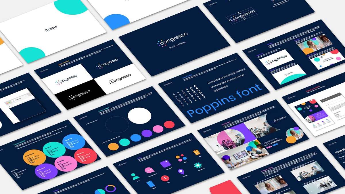
Congresso Brand Guidelines
When creating the brand guidelines, it was important to ensure all imagery, icons, social media assets, business cards etc. worked in line with their new branding.
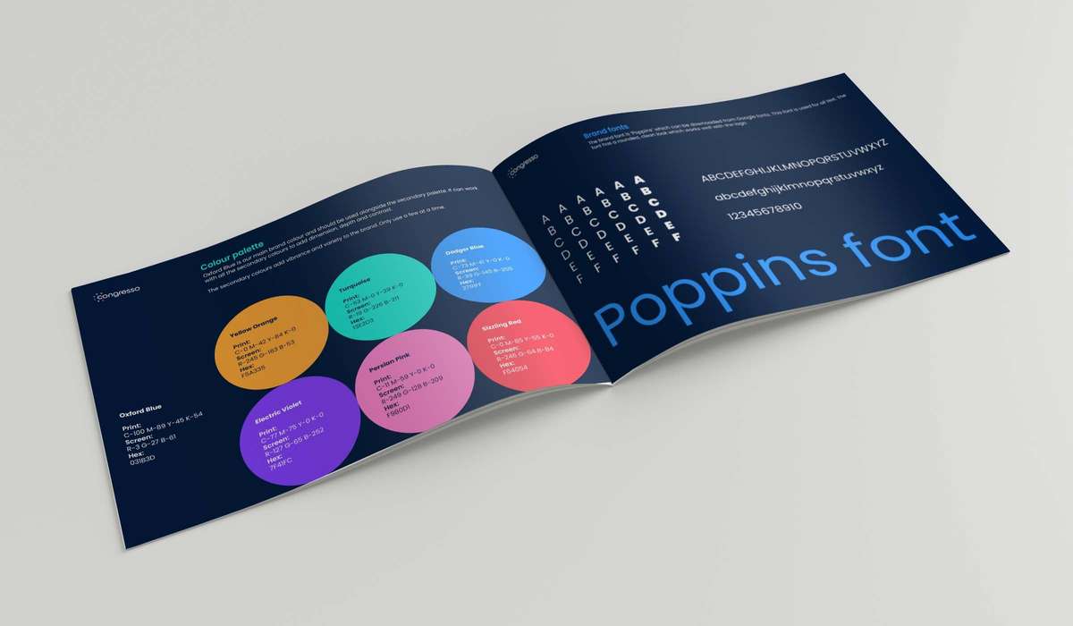
The first thing to consider is what colour palette and font would be associated with the Congresso brand. The main background colours are oxford blue and white. The other 6 colours are the colours for the Congresso circles. However, they can also be used as background colours where appropriate. The font needed to feel inviting and easy to read, leading to the font of choice being ‘Poppins’; a rounded, sans serif font that encapsulates their clean, rounded, and inviting ethos.
There are many ways in which the 6 coloured circles are incorporated into all brand, digital, and marketing assets for Congresso. They can be used:
- Within imagery to interact with the subject, represent people, ideas, documents, or increase photo dynamism.
- To frame an image with one or two larger circles.
- To create dynamic movement as long as there is a line connecting the circles to show the direction of movement.
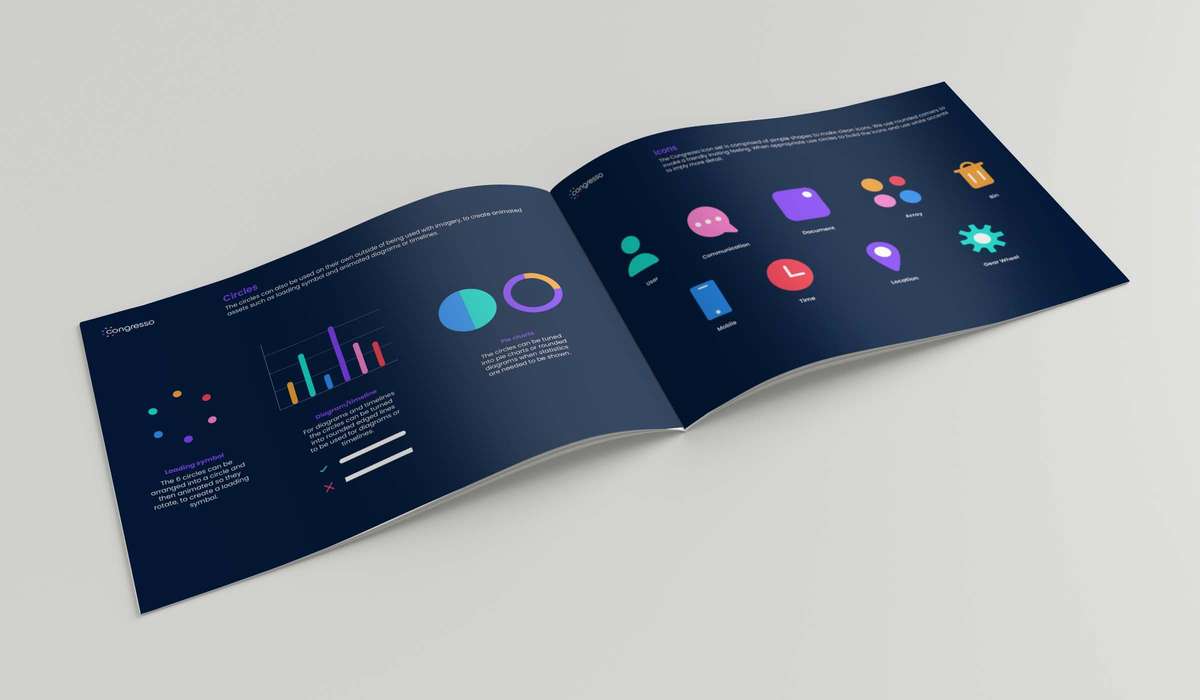
- By being stretched into lines with rounded edges for diagrams.
- To be turned into pie charts, diagrams and infographics.
All icons also have distinct rounded qualities. The difference with the icons is that further accents are created with the use of white detailing.

Congresso Marketing and Stationary:
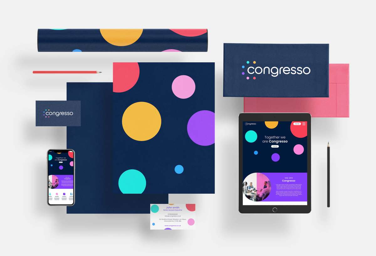
The business cards have a simple front, with just the logo on an Oxford blue background, and then the back has just the necessary contact information, on a white background, framed by the Congresso coloured circles. For Letterheads, the black version of the logo is used on a white background with some grayscale versions of the branded circles embedded within the paper.
The favicon is used for social media profile pictures. Meanwhile, social media banners utilise the usual brand graphics on the Oxford blue background. The continuous thread of the same graphic devices, logo, and specific colour palette make the brand have a consistent and complimentary design language throughout all aspects of the business.

Congresso Animated
The versatility of the 6 coloured circles does not stop at imagery. We created the concept very much with animation in mind from an early stage. We worked on an animated movement of the circles into place around the head of the ‘Congresso’ logo, but they can also be used as an animated loading symbol, or as an animated timeline using the stretched diagram assets. The nature of the graphic design language is easy to associate with movement, meaning animation can be used to create more dynamic elements on the Congresso app.