Request a brochure
To request your brochure, simply fill in the form below and we will email it directly to you...
Packaging Trends 2021

It is well known that your packaging is the first impression the customer has of your brand. No matter how good your product is, your packaging design does the initial marketing.
You want your packing to tell people everything they need to know about your brand, products and credibility at a glance. With that in mind, trends are ever evolving, as are consumer behaviours. Therefore, we have broken down the product packaging trends you need to know in 2021.
Ecological Design
Refillable, reusable, recyclable, compostable, hygienic.
The use of porous packaging like cardboard or paper is more desirable to consumers now than ever before. Not only are porous materials more often recyclable or biodegradable, they are also more COVID-19 friendly. The National Institute of Health found that porous materials only hold on to germs or bacteria for up to 24 hours. Meanwhile, plastics or other hard surfaces can be infected for up to 72 hours. Therefore, those who do not want cross contamination from the outside world find this shortened infection time preferable.
Tissue paper packaging is becoming increasingly popular over packing peanuts or bubble wrap as its more ecological and aesthetically pleasing. Carboard boxes have been the norm for packaging for a long time. However, in 2021, it is much more on trend for the boxes used to be far more personalised, colourful, and branded. Taking these steps makes your packaging eco-friendly, sustainable, hygienic, and pretty all in one go!

Personalised methods of sealing other than Sellotape
Gone are the days of single use plastics!
People are now using wax seal melt and personalised branded stickers. Having personalisation within the finer details shows off just how much you care.

Accreditation
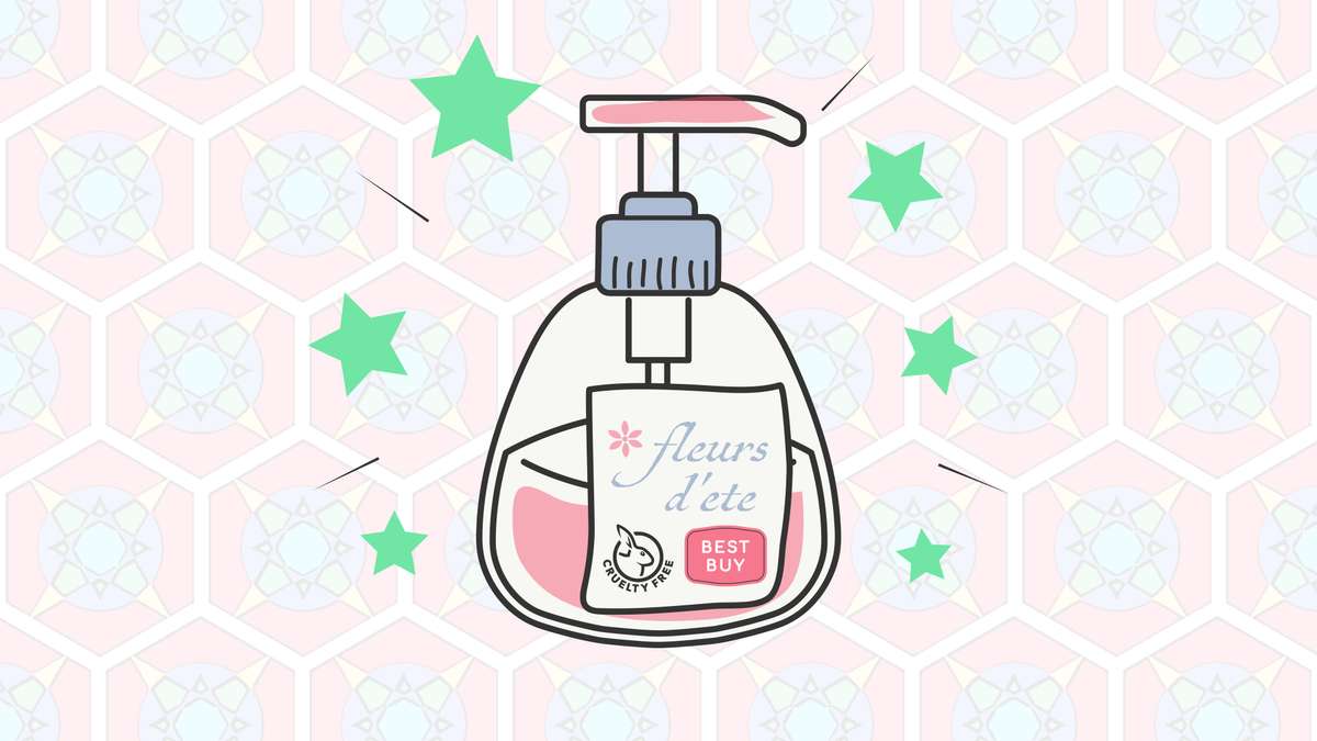
Accreditation from an established certifier like ‘which best buys’, the ‘Leaping Bunny’, or other esteemed awards makes your product that much more appealing and comforting when placed on or within packaging.
Everyone checks reviews but they are not always the most reliable. In this day and age, it is so easy for companies to fiddle with and delete unwanted reviews. We all take reviews with a pinch of salt. When a non-biased, external company approve the product, consumers are more inclined to purchase it. Put your certifications and awards on your packaging loud and proud.

Colour, artwork, simplicity
Even the most complicated designs can have a simplicity to it.
Brand story and product explanations can all be explicit by just the design on the packaging. Tiny illustrative designs that show what to expect inside the product are an emerging trend. This shows the customer exactly what to expect from the product. The design seems complicated but is actually very simple and often whimsical. This positions your brand as friendly with trustworthy products that do exactly what they say on the metaphorical tin.
On the other hand, another emerging design trend is to incorporate fine art into your packaging. Fine Art is about impact and sending a message, the work always represents something meaningful. It shows your brand as a company that care about making something as mundane as a beer can beautiful and unique every time. You do this despite knowing it will just end in the bin. The point is to position your brand as someone who puts effort and creativity into everything you do. This will be eye catching and a very unique selling point.
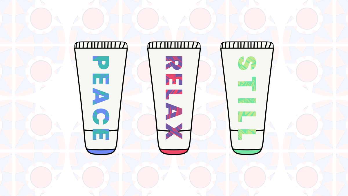
Other design trends include bold abstract/ geometric designs, reassuring design (using words like mindfulness, peace, tranquillity on your packaging), bold typography, and story driven/ comic book-like designs. All these trends give off a different feeling and can be as complicated or as simple as you want. The point is, it is important that everything you choose for your design fits in with your brand strategy and goals whilst making you stand out from your competition.

Accessibility
Brail, easy to read typography, easy to use
Accessibility is so important and is finally being made a priority. One easy way to make sure your packaging is accessible is to make sure the product is easy to use. A study by ‘Kosher’ found that 55% of responders in a survey said their number one irritant with packaging is packaging that is difficult to open. This is also true for when products are not easy to reseal if it is a product that will not be finished in just one use.
Another, more legally required than trendy, way to think about accessibility is to make sure you are using the traffic light system for nutritional values and all ingredients and allergens are clearly marked on any consumable products. Obviously, the traffic light system and ingredients are for food, but all products must have safety guidelines where necessary.
Finally, it is becoming more popular to have brail on generic packaging and products and now we think about it, why don’t more packages have brail on them? Reach more people and help them to enjoy your products too.
As a design agency ourselves, we are here to help your packaging and products stand out on the shelf. Please get in touch by contacting us on 01608 684312 or via our contact us page.